
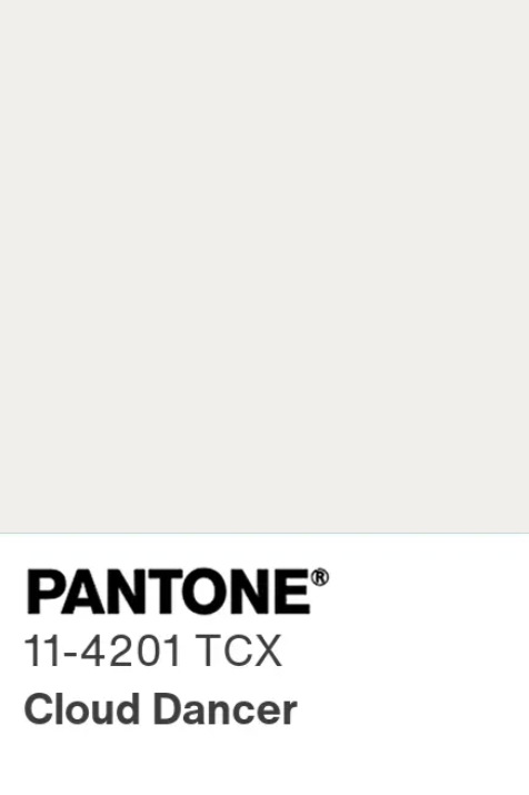
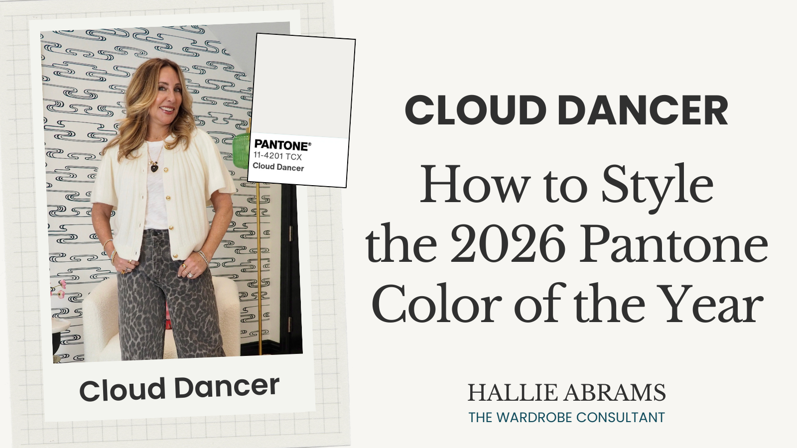
Pantone’s 2026 Color of the Year Is Cloud Dancer. Let’s Talk About It.
It’s that time of year again! The Pantone Color of the Year for 2026 has officially dropped, and let me tell you, it’s got people talking.
Drumroll, please...
It’s Cloud Dancer.
Now, I know exactly what some of you are thinking right now. You’re looking at the swatch, squinting your eyes, and asking, "Wait, Hallie... is that even a color?" Or maybe you're thinking, "Isn't that just... white?"
I hear you! It’s definitely a shift from the bold punches of color we've seen recently. But before you write it off as boring or basic, let’s dive into what Cloud Dancer is all about.
By the way…if it looks familiar, that’s because it’s almost the exact shade of off white that I’ve been using in the TWC branding since 2019!
What Exactly IS Cloud Dancer?
If I had to describe it simply, I'd say think of it as a really sophisticated off-white. It’s not a stark, clinical hospital white, but it’s also not quite a beige or a heavy cream. It’s elegant. It’s understated. It’s the kind of shade that whispers luxury rather than shouting for attention.
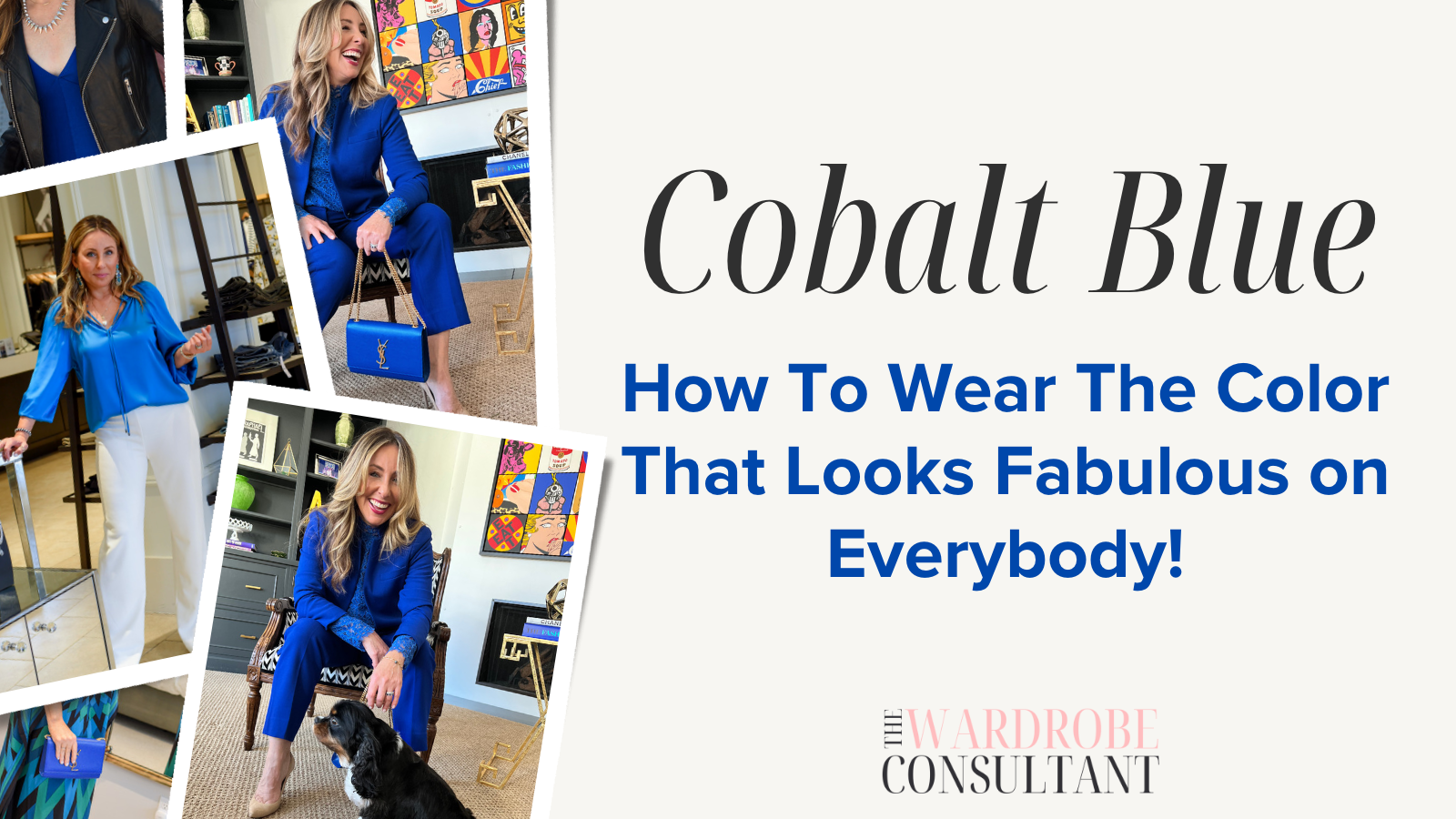
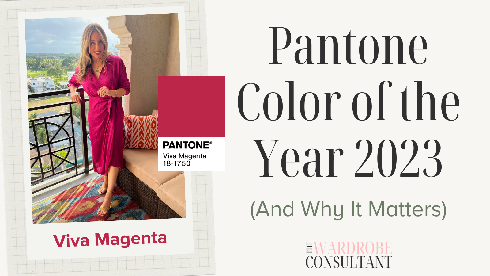
Comparing it to recent years really highlights the difference. Remember 2023's Viva Magenta? That was loud, vibrant, and impossible to ignore. Or even 2025's Mocha Mousse, which was rich, warm, and chocolatey. Cloud Dancer is the palette cleanser we didn't know we needed. It’s versatility in its purest form.
The "Not A Color" Backlash
Okay, let's address the elephant in the room. Or should I say, the cloud in the room?
There has been some backlash online. A lot of people feel like picking an off-white is a cop-out. I've seen comments saying it's anticlimactic, especially when we look to Pantone for inspiration and vibrancy. People want color! They want excitement!
I get it. When you're expecting a bright turquoise or a deep emerald, getting handed a shade of white can feel a little... underwhelming. It’s not groundbreaking in the way Very Peri was a few years ago.
But here’s the thing: simplicity is sometimes the hardest thing to get right. Cloud Dancer isn't trying to be the loudest person at the party. It's the person in the corner exuding quiet confidence who everyone wants to talk to. It’s timeless. It’s the kind of color that sneaks into your life and suddenly, you realize everything looks better because of it.
Why This Color Matters Right Now
Pantone doesn't just throw a dart at a color wheel. These choices are deeply researched and reflect the global mood. So, why Cloud Dancer? Why now?
I think it speaks to a collective craving for calm. The world is chaotic. Our feeds are noisy. We are constantly overstimulated. Cloud Dancer reflects a desire for simplicity, minimalism, and a blank slate. It’s about clearing the mental clutter. It represents clarity and a breath of fresh air amidst the noise.
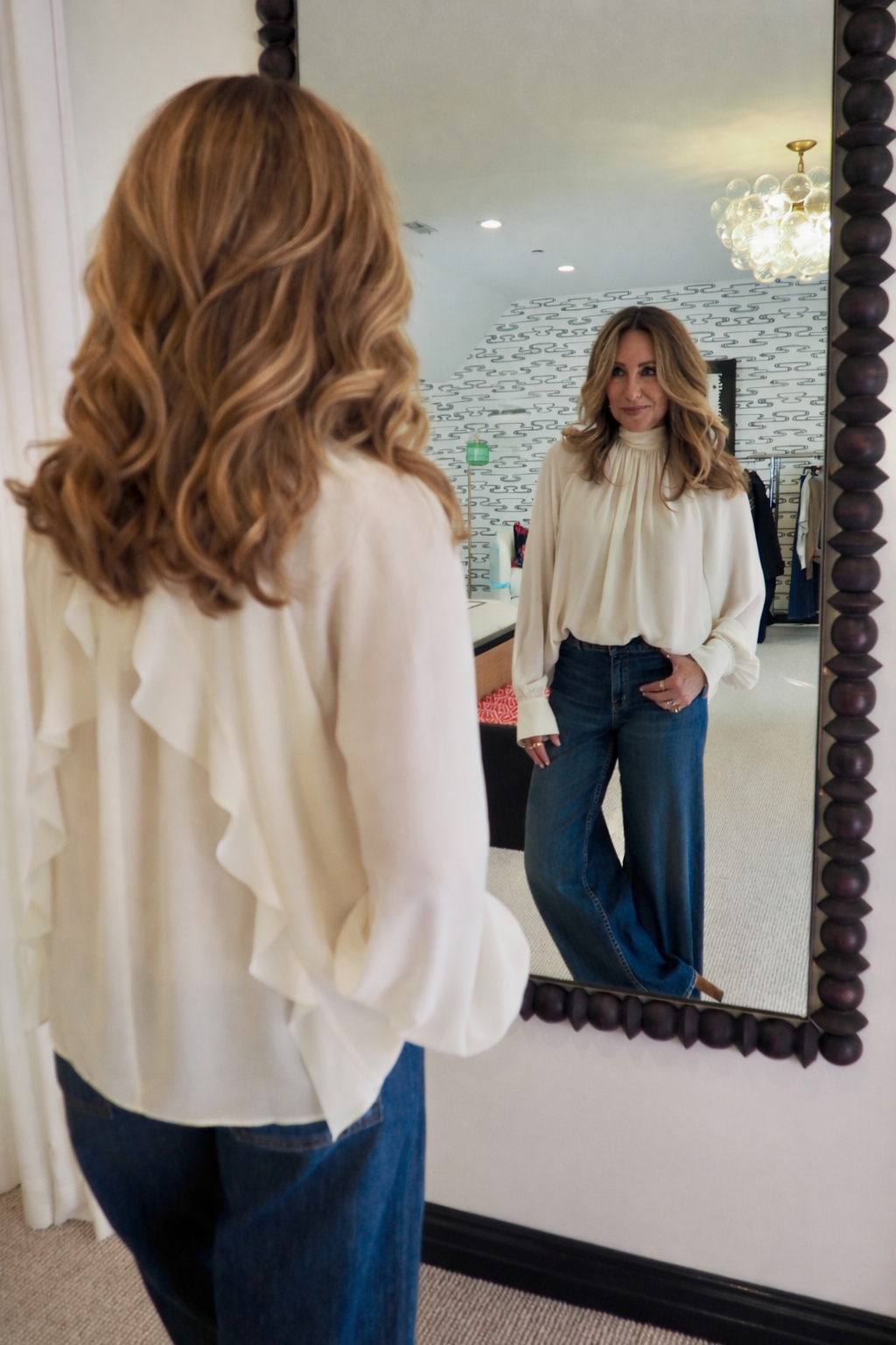
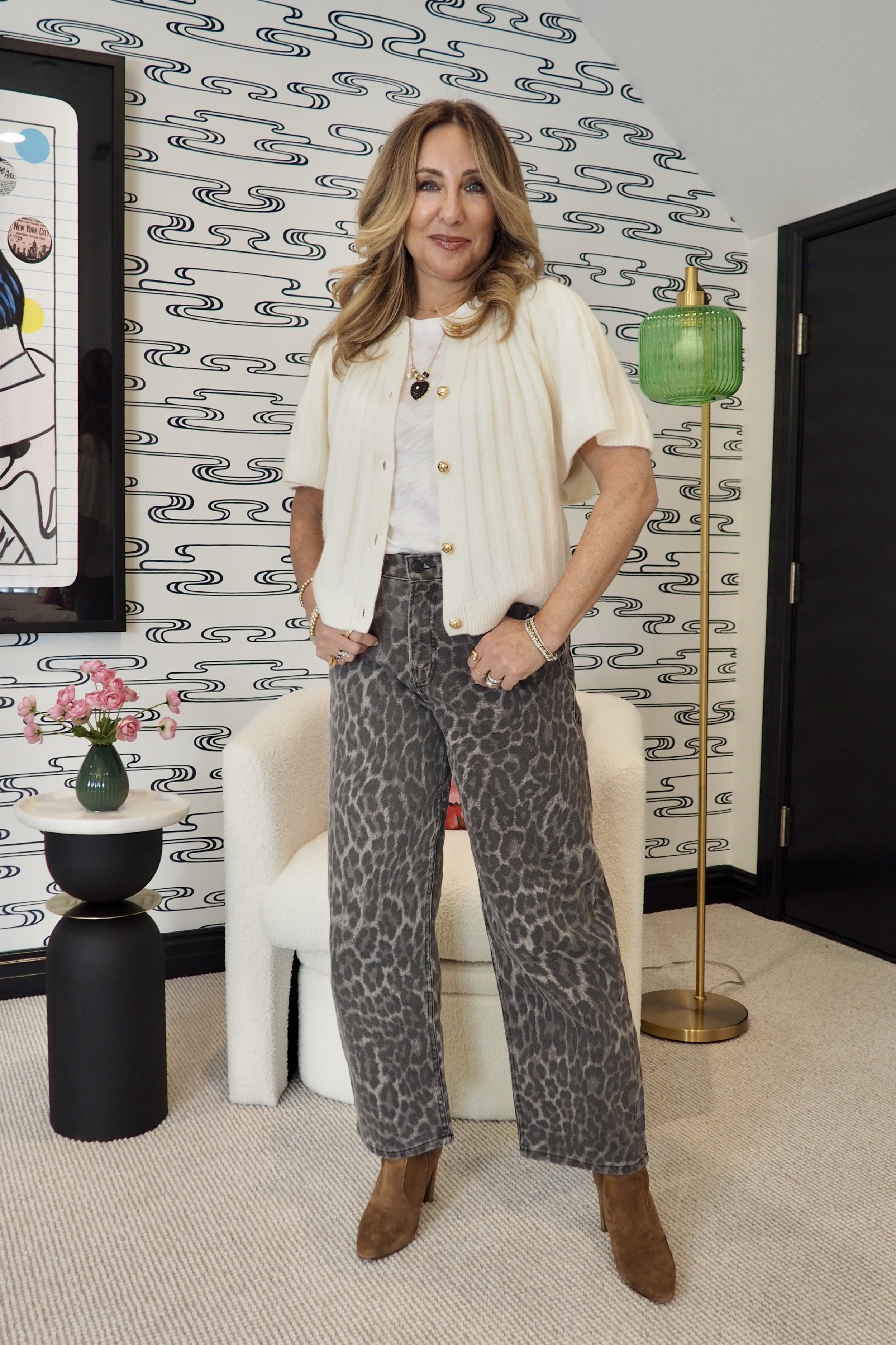
How to Style Cloud Dancer (Without Looking Boring)
This is the fun part! How do we actually wear this without looking like we’re about to paint a wall? The beauty of Cloud Dancer is that it plays well with others. It’s the ultimate team player.
In Your Wardrobe
The Monochromatic Look: This is my absolute favorite way to wear this shade. Layering different textures of whites, creams, and Cloud Dancer looks incredibly chic and expensive. Think a chunky knit sweater over silk trousers. The mix of textures keeps it from looking flat.
The Denim Duo: Pair a crisp Cloud Dancer blouse or tee with your favorite pair of jeans. It’s classic, it’s easy, and it always looks put-together. It elevates a casual outfit instantly.
Date Night: For me, this is the perfect color for a casual date night. It feels light and romantic.
Shop Cloud Dancer Clothing
Accessories
Small accents are a great way to dip your toe in. A Cloud Dancer manicure is super trendy right now; it’s clean and modern. Or maybe a handbag or a fresh pair of sneakers. These little pops of lightness can brighten up a darker winter outfit beautifully.
Shop Cloud Dancer Accessories
In Your Home
If you aren't ready to wear it, bring it into your house! We aren't just talking about painting walls (though a fresh coat of Cloud Dancer would look stunning in a living room).
Think about cozy throws, crisp bedding, or even ceramic vases. It brings that spa-like, zen quality to a space. It’s perfect for making a room feel bigger and brighter.
Shop Cloud Dancer for the Home
A Note on WGSN’s Color of the Year: Transformative Teal
Now, if Cloud Dancer feels a little too quiet for you, you’re not alone. And you’re also not out of options.
While Pantone went soft and subtle, trend forecaster WGSN named Transformative Teal as their 2026 Color of the Year, and it’s a completely different energy.
Transformative Teal is a rich blue-green that feels grounded, calming, and confident without being flashy. It’s bold, but not loud. Saturated, but still wearable. Think depth, intention, and a sense of stability rather than shock value. Where Cloud Dancer represents a blank slate and mental clarity, Transformative Teal feels more like emotional grounding. It reflects resilience, balance, and thoughtful transformation.
Styling Transformative Teal
From a wardrobe perspective, this is a color I can really get behind. It works beautifully as a statement without feeling trendy in a way that will date quickly. A teal knit, a tailored blazer, a dress for fall events, or even accessories like a bag or scarf can add richness to your closet without overwhelming the rest of your look.
And here’s the best part. Transformative Teal plays very nicely with Cloud Dancer. If you love neutrals but still want color, teal layered with soft whites and off-whites looks intentional and elevated. It’s a great way to add interest while keeping things calm and sophisticated.
So if you were reading this thinking, “I just wanted something with a little more personality,” consider this your permission slip. You can appreciate Cloud Dancer for what it is and still lean into color in a way that feels modern, wearable, and very now.
Shop Transformative Teal
My Personal Take
Alright, real talk. Am I obsessed with Cloud Dancer as the Pantone Color of the Year? Not really. Sure, I live for a good white or cream piece in my closet (hello, my love affair with neutrals is well known), but as a COLOR of the year? It’s kind of... underwhelming. There, I said it!
I get the appeal, and yes, Cloud Dancer is seriously wearable and easy to style, but part of me wishes Pantone had taken a bolder route. Maybe this is just me, but when I think “Pantone Color of the Year,” I want something that feels fresh and exciting, not the safe choice I already have hanging in my closet.
Plus, can we talk irony for a second? As the mom of the groom this year, I am specifically avoiding all things white and cream. There’s just something about steering clear of any “bride vibes,” you know? Normally, I’d be all about those airy light neutrals, but 2026 is not my year for wearing them front and center.
So while I’ll always have a soft spot for this shade in my everyday style, Cloud Dancer as the star of the show just isn’t doing it for me.
Past Pantone Colors of the Year


Now I want to hear from you!
Is Cloud Dancer a hit or a massive miss in your book? Are you team "It's classic and chic" or team "Give me the bright colors back"? How do you see yourself using it this year? Are you going to incorporate it into your wardrobe, or keep it strictly for the walls?
Drop a comment below or head over to Instagram and tag me in your thoughts. I can't wait to see how you style this hue!